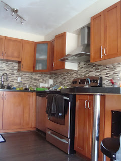
This kitchen renovation was supposed to have happened in 2014! But that's when a series of misfortunes caused pretty much annual delays (with the penultimate one being the pandemic and Humphrey's demise). I suppose the silver lining was that I had nearly a decade to collect reference photos and figure out what I really wanted.
BEFORE:
It's not that the kitchen was awful, but it was a very 1990s Home Depot vibe, with warm wood cabinets, taupe glass mosaic tiles, and black countertops. Design-wise, this it had been a DIY job by previous owners using "out of the box" layout that did not match the kitchen shape. You can see a peninsula (with no storage underneath!) which was positioned in such a way that the balance of the kitchen was completely dead space--the peninsula was in the way of a table, there should have been storage along the wall even beyond the peninsula. The floor was a dark laminate that was not laid properly (so it had gaps everywhere, and the finish was wearing off when I moved here!). Moreover, it clashed with the oak hardwood in the rest of the place. Originally, the walls were painted a fairly vibrant orange, but I repainted them in a light taupe when I moved in.
THE DESIGN:
The idea was to extend the same aesthetic from the rest of the house, including the oak floors (
this was the early tour of the place when the first set of updates/decorating was completed, and the livingroom has not changed). The colour scheme was to be mostly white, with the warm floors. Storage was key, so I envisioned a pantry (initially the plan was built-in).
As the design took shape, I ultimately decided to keep (and repaint) the cabinets since the wood was good and they were a fairly neutral shaker style. Because of the placement of the sliding door, having a built in pantry became a huge logistical challenge (the pantry could only be as deep as where the sliding door started, obviously). In the end, I was able to pick up a stand-alone pantry for $400 on sale that I think fits the space well, and I'm quite happy with it.
I made some spur-of-the-moment design decisions when Lowe's in Vaughan was closing down, and I was able to get materials for 80% off, including a Carrera marble mosaic backsplash in a herringbone pattern! The countertops are quartz with a beige vein to pick up the warmth of the floors (which now match the livingroom/diningroom oak) and gold-tone accessories. Some of the decorative accessories (including the rug and the tiny dog sofa) were things I got years ago when this renovation was supposed to take place.
AFTER:
 |
There is now a glass dinging table over that rug, and acrylic
chairs so that nothing obscures the view and sunlight. |
.png) |
| Detail of cabinets, countertop and hardware. The drawer pulls are a brushed gold. |
.png) |
A brushed gold faucet (which is more subtle than I expected, yay!)
I wasn't sure about mixing metals, but in the end I think the gold reads as
a neutral/brown, and it corresponds to the floors.
I love this fancy new sink with all the accessories. |
 |
All the dogs love the teensy lounge! Can you spot Harpo there?
Soon there will be a tiny "Central Perk" sign over the little sofa:)
Once everything came together, the greenery from the balcony and beyond became really prominent! I brought in an artificial palm to tie the green into the room, and it makes the natural green stand out even more. For summer, I will be using palm-themed textiles (cushion covers, tea towels) to bring even more life indoors. |

.png)

.png)
