Thursday, October 31, 2024

The Coco Powder Room

Given the exterior facelift of the house and its midcentury age, I thought the interior called for menswear-inspired (possibly tuxedo) colours, textiles and textures with emphasis on black and white. As I looked for inspiration on how to approach it, I realized that Chanel-inspired would fit the bill.

I had reservations about using Chanel as an inspiration due to her checkered WWII conduct. Checkered is putting it mildly, her actions were beyond awful.  After a lot of consideration, and checking with a few people to see if it would be offensive to incorporate Chanel iconography into the house, I decided to go with it, but more as a tribute to the genius of the Wertheimers who were a step ahead of Chanel and have kept the brand a family-owned (and Jewish) company.

That's a huge preamble to the inaugural project, the Coco Powder Room. Early on, I wanted any one thing completed since the entire house looked shabby. The first floor powder room was a project that could be completed quickly and without great expense. 

Here is the powder room before. There was nothing exceptionally wrong with it. It was a dingy off-white with a butter-yellow-faux-marble countertop, no real style. The semigloss paint didnt' do it any favours. 


Working from various inspiration photos from the Chanel condo development in the UK and the Chanel suite at the Ritz in Paris, I focused on cosmetic upgrades that would give it a slightly art deco feel and stick to black and white. I was planning to add a quartz countertop with a vessel sink (since the built-in cabinets fit perfectly and I actually liked the shape of them. Once the transformation was complete, I decided to delay the countertop and sink upgrades to save a little money on this phase of renovations. This is the after from a similar view:


Adding some bold art to the walls probably had the biggest impact. The first is a large-scale photo reproduction of Chanel herself - the photo was taken by Man Ray in the 1930s. The two smaller pieces are botanical collages (which I hope to eventually change to some botanical water colours in predominantly green). I used Ribba frames from Ikea which were being discontinued early this summer, so I was able to get small frames for $2, and the large frame was about $8.

Once the photos were hung, the builders' basic frameless mirror didn't cut it. This heavy-framed mirror with a beveled edge was on sale for a steal at a local furniture shop, so I picked it up for the space for around $50. The new mirror extends the length of the countertop. 


For paint colour, I painted test areas of a number of Benjamin Moore whites on the walls, finally settling on Paper White OC-55 in a matte finish (leftover from the other house!). It's a clean white with cool undertones--when I used it in my previous house where it looked white. In this room, it looks purply-gray in most lighting situations, and I like that the room looks like a black and white photo!


I added a towel ring and hook (not shown because it's behind the door) in matte black, which were very inexpensive online. I have also been swapping the old door knobs for modern matte black levers which also tie into the design. 


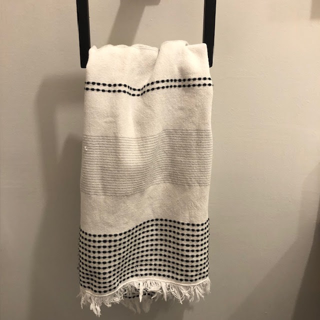
I wanted towels and other accessories that reflected a menswear aesthetic. I found these towels at Homesense, and I loved how they reflected the look of classic Chanel tweets and top stitching, with a crisp white background (like a clean white shirt). They have a cotton poplin-like front, and terry back which adds to the crispness but also makes them functional. We've been using them all summer, including washing frequently, so they are not as crisp as when they were new in this photo.

I did a few things to the vanity. First off, I applied a faux finish to the formica (or in today's parlance, laminate) countertop to make it white instead of the awful original yellow! It was easy, and it's held up without a single scratch for months (with daily use, and it has taken some abuse by contractors). More on the technique in a moment.

I added decorative moulding to the vanity in gloss black to repeat the black frame pattern, as well as give it that Chanel retail store look. I used a flexible gloss black vinyl moulding - so I was able to cut the mitres with sharp scissors, and it had a self-adhesive back. It has stayed on for months with no signs of problems, and really looks like wood. The total cost was about $14. I kept the oriental-look rug (which was also from |Homesense several years ago) because it is consistent with what Chanel would have had in her art deco and midcentury room designs. 


The countertop faux finish was another huge savings - it actually didn't cost a thing because I used leftovers (which I'd originally paid about $5 for on clearance!). 
I began by taping off the countertop, cleaning it with TSP-E to make sure it didn't have any gunk on it, then sanding it for a rough surface. I applied 2 coats of Zinzer BIN primer (I always keep some on hand and this was a leftover can), allowing ample dry time. I used 2 coats because laminate can resist paint.

For the base colour, I used a a leftover can of Valspar Chalky Finish paint (which was on clearance for $5 and I used it for other projects - a superb product) tinted in Valspar Swiss Coffee. I applied about 4 thin coats of that to ensure excellent coverage. 

To create the faux finish, I put a little bit of the Valspar paint in a cup, and used artists acrylics to tint it a warm gray shade that looked like quartz. Then, using a variety of small artist brushes and a natural sponge, I drew lines that I thought were similar to real quartz, sprayed with water, and pulled the paint out from the line to mimic the look of quartz shading. Because this was all latex/acrylic, I was able to "erase" any mistakes with more water before they dried. It was quick since quartz has relatively few veins (compared to marble) so I basically did 2 large dramatic veins on the whole surface. 

Once dry, I applied 2 coats of the topcoat that goes with the Valspar Chalky Finish paint - it's Valspar Sealing Wax in Satin Finish (not actually a wax, it's a durable polyurethane that I've used on painted kitchen cabinets). It created a really lovely satin finish as expected, and does not look or feel like paint. 

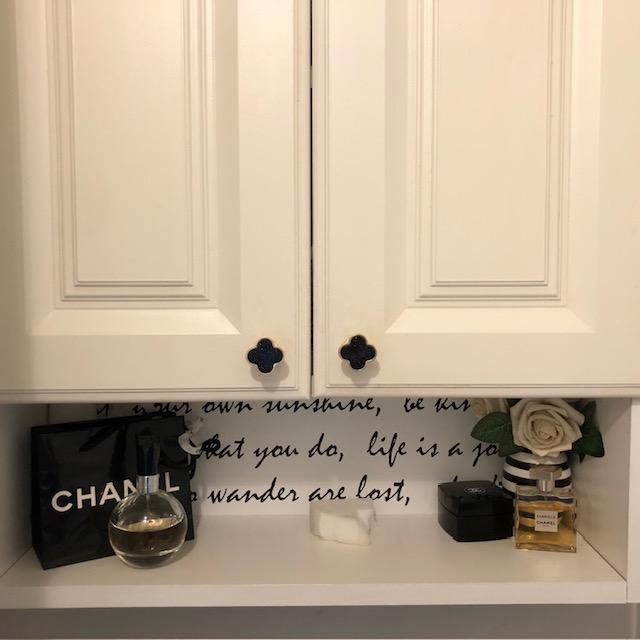
A final detail was the medicine cabinet above the toilet.


I added clover-shaped pulls in solid brass with black enamel centres (around $6 from either Amazon or Temu, I don't recall which!), and applied the peel-and-stick handwriting wallpaper (which I received for free) inside and the cabinet and behind the shelf. Because it's a quite old cabinet and had seen better days, the wallpaper freshened up the inside and makes it look very cheerful. I also used this wallpaper in an adjacent linen closet to freshen up the look inside.

I styled the cabinet shelf with a little Chanel shopping bag, some Chanel cosmetics and fragrance, and a little camelia in a striped vase--all of which I had from before. It's not pictured, but I placed a fern in a black and white striped hat box on top of this little cabinet.

It's a cheerful and whimsical little powder room and I'm so pleased with how it turned out - especially since the entire transformation was around $100 thanks to using up leftovers, scoring a few freebies, and finding things on clearance. 


Saturday, March 16, 2024

Kitchens, kitchens

This kitchen renovation was supposed to have happened in 2014! But that's when a series of misfortunes caused pretty much annual delays (with the penultimate one being the pandemic and Humphrey's demise). I suppose the silver lining was that I had nearly a decade to collect reference photos and figure out what I really wanted.


BEFORE:

It's not that the kitchen was awful, but it was a very 1990s Home Depot vibe, with warm wood cabinets, taupe glass mosaic tiles, and black countertops. Design-wise, this it had been a DIY job by previous owners using "out of the box" layout that did not match the kitchen shape. You can see a peninsula (with no storage underneath!) which was positioned in such a way that the balance of the kitchen was completely dead space--the peninsula was in the way of a table, there should have been storage along the wall even beyond the peninsula. The floor was a dark laminate that was not laid properly (so it had gaps everywhere, and the finish was wearing off when I moved here!). Moreover, it clashed with the oak hardwood in the rest of the place. Originally, the walls were painted a fairly vibrant orange, but I repainted them in a light taupe when I moved in.


THE DESIGN:
The idea was to extend the same aesthetic from the rest of the house, including the oak floors (this was the early tour of the place when the first set of updates/decorating was completed, and the livingroom has not changed). The colour scheme was to be mostly white, with the warm floors. Storage was key, so I envisioned a pantry (initially the plan was built-in).

As the design took shape, I ultimately decided to keep (and repaint) the cabinets since the wood was good and they were a fairly neutral shaker style. Because of the placement of the sliding door, having a built in pantry became a huge logistical challenge (the pantry could only be as deep as where the sliding door started, obviously). In the end, I was able to pick up a stand-alone pantry for $400 on sale that I think fits the space well, and I'm quite happy with it.

I made some spur-of-the-moment design decisions when Lowe's in Vaughan was closing down, and I was able to get materials for 80% off, including a Carrera marble mosaic backsplash in a herringbone pattern! The countertops are quartz with a beige vein to pick up the warmth of the floors (which now match the livingroom/diningroom oak) and gold-tone accessories. Some of the decorative accessories (including the rug and the tiny dog sofa) were things I got years ago when this renovation was supposed to take place. 


AFTER:


There is now a glass dinging table over that rug, and acrylic
chairs so that nothing obscures the view and sunlight.  

Detail of cabinets, countertop and hardware. The drawer pulls are a brushed gold.

A brushed gold faucet (which is more subtle than I expected, yay!)
I wasn't sure about mixing metals, but in the end I think the gold reads as 
a neutral/brown, and it corresponds to the floors.
I love this fancy new sink with all the accessories.

All the dogs love the teensy lounge! Can you spot Harpo there?
Soon there will be a tiny "Central Perk" sign over the little sofa:)

Once everything came together, the greenery from the balcony and beyond became really prominent! I brought in an artificial palm to tie the green into the room, and it makes the natural green stand out even more. For summer, I will be using palm-themed textiles (cushion covers, tea towels) to bring even more life indoors.


Monday, July 31, 2023

The Herschel Plouffe Mysteries

 Harpo's acting debut as Det. Herschel Plouffe, Canine Sleuth, of Belgium. Be sure to expand the video to full-screen mode for better viewing ;)


Wednesday, June 28, 2023

Moses Supposes His Toeses are Roses...

 ...but Moses supposes erroneously..

Harpo stopped and smelled the roses  in bloom (and sang/tapped a little Gene Kelly & Donald O'Connor number about the blossoms).


Monday, April 24, 2023

"Harpo, how many times do we have to tell you walks are not a Wes Anderson film!"


Welcome Harpo Byron Fidrych!

 Not long after Humphrey's demise, I thought I should apply to foster or adopt a dog, knowing that the screening process and wait for a suitable companion (small, non-shedding, preferably not elderly) could take time. In searching rescues and adoptions online, I came upon a three-year-old black poodle retiring from the show ring who was seeking a home. I completed the adoption form.

Soon after, I received a response that the black poodle had found a home already. "You're probably not interested interested in a white pup," the person said, presuming that I had a colour or age preference. She mentioned the date of birth - this pup was born the day that Humphrey died.


Linda had been breeding and showing black/silver and brown poodles for thirty years. Haley, a silver toy poodle, was a first-time new mom with champion sire Eddy (or as we call him, Fast Eddy). The first two puppies, both female, were born late in the evening, and came out black. After midnight, a third was born--the first white pup Linda's dogs had produced in thirty years. 

I couldn't say no to the opportunity. 

From the moment he opened his eyes, the white puppy keenly observed the world and met his developmental milestones weeks before his sisters. Linda named him Byron because he had the "eyes of a poet", though we wanted to call him Harpo  for his white curls, and that he squeaks to communicate like Harpo Marx.

As the weeks passed, Harpo grew quickly, and it became apparent he would be larger than his parents - in fact, just about the size of Humphrey.

Here's Harpo discovering his reflection in the mirror after arriving at his forever home...